|
Monday, September 26, 2011
Emoticonned
2:09 AM
For NYMD's production I.D.2010, I was the in charge for costumes of the item: Emoticonned.
"Emoticonned" shows the life of 4 different types of toys: Dolls, Puppets, Clowns and Magicians
We live in a toy shop and we are left on the shelf or children buy us and then when we are spoilt, we are left alone to collect dust. we are desperate for attention, care and concern, we ask our owners, "Why don't you take me in your arms now?"
For the puppets, we agreed on a very boxy effect, like they are "chopped up" to show the different limbs, hence the cropped top and why they do not wear short tights like the rest of the characters. Just like a puppet, it is like they are very stiff, and for the make up (if we can play with makeup) they had a stitched up scar across their face, to show as if they were repaired before. Also, the arm band and the leg warmer is to emphasize the stiffness of the puppets and shows that a string can be attached to them, to be controlled.
For the magicians, i played with the colours red, white and black. White magician gloves, white vest black tights, red latex leggings and a golden hat (which is thrown out of stage early in the performance). I feel that although the design is very simple, it brings out the persona of a magician even without a wand or hat which many associate magicians with.
For the clowns, we decided on funky colours, like yellow! So i made yellow ruffle collars for them with the help of my mom, and sewed on 2 yellow buttons on their maroon leotard. Also, they have bright yellow leggings and black tights to match with the magicians.
For the dolls, they have a very sweet and ballet-like feel to them, like ballerinas. They have a bun/pony tail (if hair is too short) which is neatly tied up, then a floral scrungie is tied around the bun/pony tail as a decoration, to show their innocence. The make up is very rosy cheeks with a heart shaped lip (similar to that of a fish). They wear a white skirt with some stripes of colours, with ballet tights and ballet shoes. There are silver ribbons tied to their leotard straps because ballet usually make use of ribbons.
All the costumes are actually everyday clothes bought from Bugis and Daiso. For example, we bought the leggings, vests, cropped tops and skirts from Bugis. Also, The leg warmers, arm bands and clown buttons are from Daiso. We also had many scavenger hunts around the house and the costume closet to find clothes like the floral scrungies, ribbons, gloves, ballet shoes and ballet tights. Sometimes i would have to help and "custom make" the costumes by sewing the pieces together or making something simple, like the clown collar and attaching their buttons.
To me, the hardest part of this project was the purchasing and collating all of the different pieces of costumes. I handled large amounts of money on every trip and I had to be very cautious with where i put them and had to organize my receipts and purchases very well.
It was really tiring to be in charge of costumes for this item and I've been to Bugis Street at least 10 times within that period, just to hunt for costumes, compare prices, get the cheapest one, pre-order and wait for stock before collecting, etc. But I am still very honoured that my batch put me up to this job. Even though I sometimes get annoyed with some shop owners who refused to cooperate or try to cheat us because I am a student, I was also touched that many of them volunteered to tag along and help me hunt for the costumes.
Although I've been to Bugis Street so much that up to now (1 year later) I am still sick of that stuffy place, I have never been there alone because my friends are all willing to help me. Even when I was sick, my batch mates told me to rest and they would go down to collect the costumes and that I should go home to rest. They were all very appreciative and helpful. Indeed, it was tiring and sometimes I felt as if the costumes were so messy, I would never be able to complete them and that they are up to standards. In the end, with their help, we did. My seniors even complemented me and my batchmates' smiles make me feel as if it all was worth it, as if our costume hunt was an ultimate budget shopping spree, it was super fun and enriching.
This is one of the unforgettable memories I've had with NYMD :')
Labels: art works, others
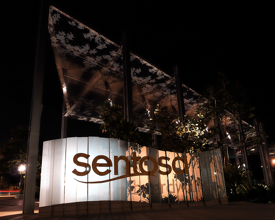
Sentosa boardwalk
12:44 AM
During the june holidays, my dad and I went to check out the Sentosa Boardwalk's night scene (his friend told him to check it out). It was really amazing and the view was just so magical, I felt like everything was a dream and it was actually quite romantic (weird because i was with my dad, hahaha)
Anyways, we had a photography session there and we took turns to play with the camera :)
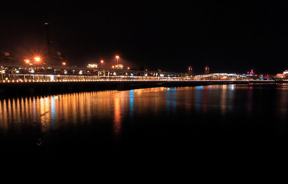
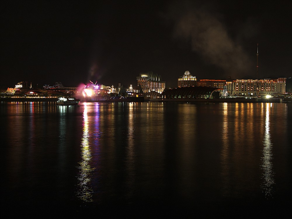
The bridge that links Vivo City to Sentosa, it seems very long but actually when you walk down the bridge, the scenery actually takes your focus off the distance and the walk is truly enjoyable. This is taken from the "banks" of Vivo City. I erally like how the lights are reflected off the water, they are so colourful, instead of being all white or all yellow, there are actually shades of blue and pink. There were boats on the right, in the water. But it was too dark to be taken, they didn't look very nice with flash either..
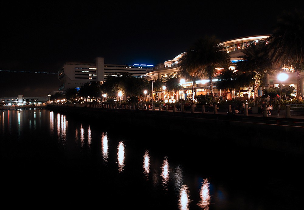
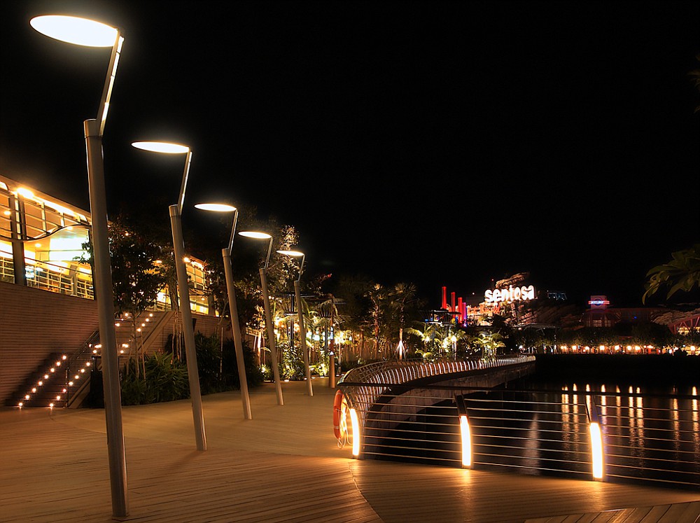
And so the journey begins. Look at the contrast between the colour of the lights, Vivo's lights are all white, while Sentosa's lights are so colourful. I guess this shows the difference between the commercialized world and a resort style world.
Half way across the bridge, the Song of the Sea performance is currently on, which explains the burst of light. I could hear the performance from where I was standing, who needs a ticket right? hahaha
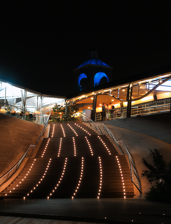
Approaching Sentosa!
To see the rest of the album, click here!
This was also taken with the Oly Pen EPL1, I really like this camera, it's so user friendly and captures amazing photos. :)Labels: art works, photography
Sunday, September 25, 2011
Labrador park
1:31 AM
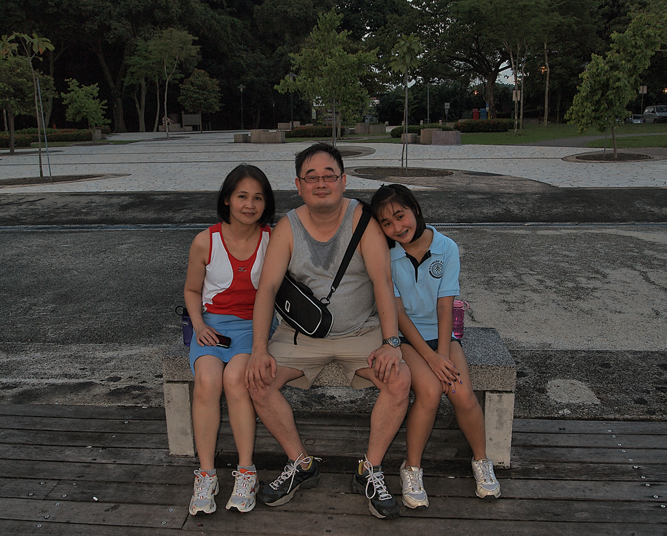
At the start of this year, my dad wanted to go to labrador park to test out his new camera- Olympus E-PL1 (which i have now became the official owner. bwahahahaha)
So I tagged along for a run to build my stamina for SYF2011. After my run, i played with the camera and took a couple of photos:
This was taken from where i was sitting, waiting for my mom to come back from her walk :) Also, one of the few non-editted photos (my dad editted the rest). I really like how tall the satelite looks behind the trees, i was hoping i'd capture the essence of its height, but i felt it could be done better? oh well.
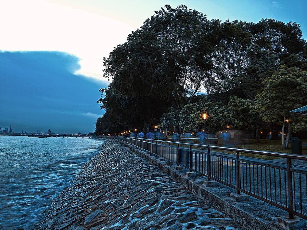
Before the sun set, everything still looked quite peaceful,
While the sun was setting, looks pretty sinister eh? I'm not sure if this is photoshopped, i cant tell... it looks photoshopped, but then again it doesnt :/
Another picture of the park, from the porch(?) at where we were sitting at, to our right was the outline of the park and so i decided to capture this as it shows 2 sides of the world to me, like the dangers of the sea and our safe home. I wanted to capture waves crashing on the rocks but the tide refused to cooperate. -_-"
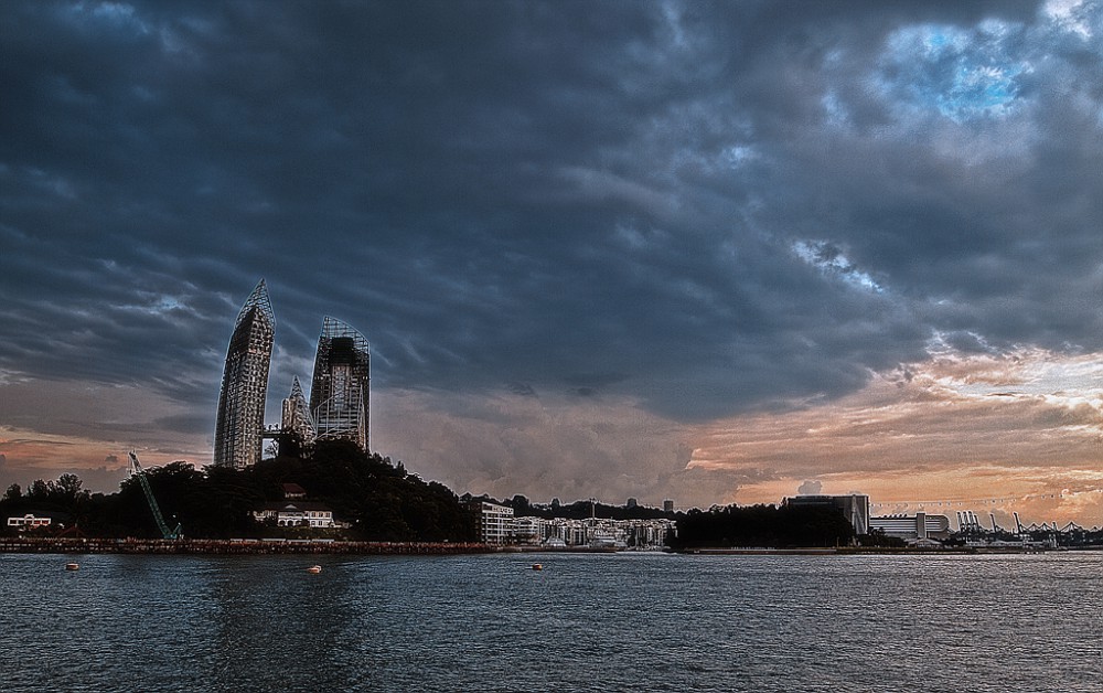
If you can tell, this is Reflections, the condominium building near harbourfront! This is one of my favourite architecture designs because the gentle curves of the buildings are really hard to build, and to me, i feel like the building seem to intertwine subtly, and shoot for the skies.
Note: my photoshop skills are one kind of shitty, it is my dad who photoshopped the pictures.
To see more of his photographs and my childhood pictures, go to his fotki page
I guess you can say my dad's the one who made me fall in love with photography, he's the one who showed me how to use your camera to capture things from a different angle or draw attention to something people would usually take granted of.Labels: art works, photography
course work final
1:30 AM
The Best of Life's Recipes:
A recipe book that reflects life, and its components. By using different ingredients to represent different attitudes, I make use of food to show the ideal way to live your life, so that you become a better person. The recipes represent ways to improve your life by adopting certain traits and attitudes. In other words, if you adopt the habits mentioned in my works, it allows you to become a better person.
Here are the first 5 pages of my course work (4 including front page):
BASICALLY, IT IS TO BE PRINTED ON A4.
There is a line that cuts the A4 paper into the above size and it serves as my margin so that when i bind my book, i know that i cannot exceed this line. But luckily for ya'll, i am no longer lazy and cropped all the pages to what you should see in my book (excluding the binding portion).
The recipes are kind of self explanatory from the text so please click on the image to enlarge to read more about the recipe,
and i would just talk about the materials and how i did it.
I used illustrator to create the front page and all the text. Going for a more fun and casual feel to the works, i decided to use a hand writing font, as if it was hand written out. Also, i changed some words and ingredients to represent what they meant, like "hard" would be seen as "HARD".
For the front page, i made it cute and bubbly, hence the polaroids are outlined with a dash line, instead of a hard line, to make it more jumpy and playful. Also, the block letters are in a very child like manner, making it seem happy and joyful. I also added in polaroids as to me, polaroids are like capturing important moments, just like how all kinds of food are important, and that every ingredient added is also important. It makes up the recipe, just like how our characteristics make us up.
The drawings are all done in colour pencil or sometimes water colour and then scanned in. They are then used as back ground images or page numbers or pictures in the polaroid.
I decided that for every step of the recipe, i would use a food to represent the page number, which is a idea suggested from Mrs Tan, and i feel that it really makes my work stand out a little bit more :)
Also, the background images used to be smacked right in the centre which was very distracting indeed, so I shifted them around, cropped them off the page, etc. I hope that my final composition actually helps to lead the viewer's eyes to the text and the main point of the recipe. To me it did, but hopefully to ya'll it did the same!
The last page of the recipe would be an illustration of the works "coming to life" where by the ingredients come together to create the recipe, it is very representative and if you read the steps and the description of the recipe, it would be reflected in the works.
1st recipe: Chocolate Lava Cake
the drawing is to show that the cake stands out strong in the ruins of shattered chocolate. To show that it is rebuilt and stronger than before, that one's self esteem is higher than before. I placed it in the centre as the crushed chocolate also emphasizes the cake, they are of different sizes to show the different extents to how much one's self esteem can be crushed, be it very small, or still quite a large piece. And the chocolate that flows out shows the process of being molten before, that this is no easy journey. The ingredients that pour into the cake such as: Butter, Eggs, Milk, Flour, and Sugar, are actually representative of attitudes one should adopt in order to rebuild one's self esteem when it is crushed. To understand more, please click on the steps :)
I hope that the words would help to enhance the feelings of the work.
Labels: art works, coursework
course work #2
1:04 AM
These are the remaining pages of my coursework
The 2nd recipe: A burger to symbolize determination
The background fries as grass and a cloudy sky is to emphasize the height of the burger, which shows that it starts from the ground and reaches the sky. The fries was just playing with food because fries usually come with a meal in a fast food restaurant right? The flag at the top is like your goals, and the fact that it is planted deep into the bun shows that it is possible to conquer them (similar to how we planted a flag on the moon). The burger is swaying, from left to right to show how difficult life is, some times the surface area of which the next layer is able to pile on top is very big, sometimes it is very small. I used this to depict how we have to keep our balance and not topple over. Also, ingredients are falling out of the burger to represent relationships, whereby people will leave you and objects may break. I have ingredients like Healthy Ham, Relaxing Lettuce, Happy Cheese, CryAway Onions, etc. to show that in order to achieve our goals, we have to remember to be healthy, to take breaks, to see the joys in life and that everyone will cry as there is nothing wrong with crying. After all, after you cry, you do feel much better and happier.
I hope that people will understand that at this moment, life may seem in a mess and you're about to fall and break down but there is still hope, relax and stay positive, keep your balance and keep moving forward. The higher you go, the nearer you are to your goal.
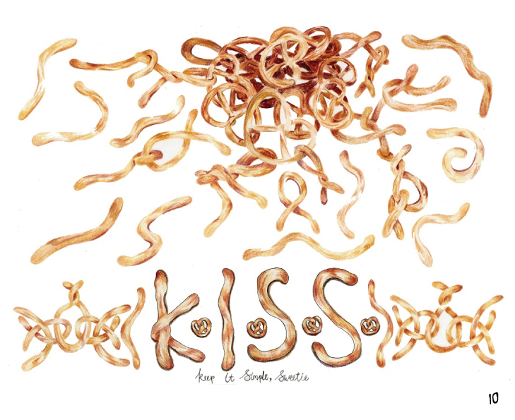
3rd recipe: Simpretzel | Simpretzle
There will be many incidents in which you find your life in a complete mess, and you're struggling to find the answers. Of course, when you're unsure about everything and you can't see the main problem, how are you going to be able to solve it? Hence, I suggest simplifying your problems and unravelling them. Just like how a pile of pretzels looks more complicated than a single pretzel, and a single pretzel looks more complicated than a long line of dough.
K.I.S.S. stands for: Keep It Simple, Sweetie (or stupid, depending on context. hahaha)
which is straightforward enough, keep your life simple, do not complicate matters. Keep your problems small and within control, rather than problems blown up so big, they are no longer controllableLabels: art works, coursework
Saturday, September 24, 2011
Birthday Card!
8:15 AM
This is a card i made for my mom's birthday last year!!
And this card is significant to me because this is the first time i touched colour pencils since i was a child, and also the first time i am colouring the human form, realistically.
To make this card, i also used ribbons, letter-stickers and markers, but that's not the imporant bit. It's very similar to scrapbooking, really. I even drew my mom on a blank sheet of white paper then cut her out and pasted it on the card.
Before this card, the only time i used colour pencils was when i was in p4 and was colouring within the lines given. How do i know i was 9? My colourpencil box had my p4 class (4j) written on it, and im very sure i did not touch any in p5, hahahaha!!!!!
This card was hard to make because i wasn't very sure with my colour pencil skills. Also, as my colour pencils are ridiculously old, the colour would not rub off on the paper properlly :( So i had to press really hard, which in turn created indents, and made it even harder to colour.. Also, i wasn't very sure how to mix the colours and how exactly to blend 2 colours together. I also could not use pencil to sketch my mom first and then colour over because she would have a pencil outline and no matter how much you erase, there will still be a pencil mark. So i started off with her face, hen her neck and lastly her hair. I remember spending close to 3 hours drawing her and even though it is not perfect, i feel like i captured her happy glow, just like in the photo of her. I truly am proud of myself as to me, this is my first realistic colourpencil work.
My mom finally got her answer to why she had to dig out my colour pencils from the store room 3 days before her birthday, and also found out that it wasn't school work. This would be the few out of the many occasions whereby i lied to her and she didn't scold me. But what really meant to me the most, was the smile on her face when she saw the card, I could tell she was really proud of me drawing this and definitely did not regret forcing me to try out for AEP. :)Labels: art works
Scrapbooks
7:07 AM
Although scraps that you buy from stores are always prettier than the one you really scavenge for, we feel that the whole fun bit about scrap booking is really just finding bits and pieces of paper/stickers in your house and pasting them.
I find my materials from my sticker book which is like close to 10 years old! As well as magazines, news papers, pens, coloured paper, scrapbooking gifts from friends, markers, pens, scissors, etc. Basically, with all these, you can start scrap booking too.
I like to decorate and personalize notebooks for myself, as well as for my friends (as a gift!), mostly for friends. I feel that notebooks are more meaningful because when you write something inside, it is also another way of scrapbooking to me. And more importantly, it is a scrapbook. Also, notebooks are very useful unlike cards.
I just grabbed the 2 nearest scrapbooks i have within sight and here they are:
This is my first notebook i made in p6 (old, i know), and also the notebook my cousin taught me how to scrapbook with. Back then we used to have this autograph craze, and inside are the contacts, likes, dislikes and messages of my prischool friends. Everytime i open this book up to read, it really makes me laugh at our grammar mistakes, our innocent minds and stuff. This book really means alot to me, it's almost as if my pri school days were recorded down inside.
You can see Rihanna having her swag on, she's there because I used to love Rihanna, but now i dont. My cousin sponsored me stickers then. I stuck the bear there a year later though, just to match the heart to form a diagonal line. And the rest was done with coloured paper.
This is the notebook i used for biology last year :)
It was initially meant to be my diary, but after 2 days i gave up on
documenting my life and so i decided to document my notes instead...
The
bear is a sticker which Jielin gave to me, I bought the letters from
ntuc (budget, you know?) and the paper was from my cousin who didn't
like the design anymore :P The binder strap is actually one of my old
hairties, as you guys know, i no longer have long hair so it's better to
use the hairtie than to throw it away!! I also added in ribbons and some pink and purple colour paper.
To me, the most fun part about scrapbooking is just ransacking my box-of-possible-scraps and choosing the few materials to stick it down. Also, shifting them around, trying out different compositions and being innovative is what makes scrapbooking so special. Anyone can scrapbook, you don't have to be rich to buy the mad-expensive materials, just coloured paper from popular, magazines, and you're good to go. Anyone can scrapbook, why don't you give it a try?Labels: art works
Wednesday, September 14, 2011
Class Tee
1:50 AM
# Class Tee
I did this with Ruisian and in a way, Xingting.
This is my class tee shirt design for 2010:  For 307'10 <3 We were going for a more mature look, which means that.. no more cartoons no more cute little quotes and everything no more designs that fill up both sides of the shirt no more 30+ names that clutter the back of the shirt no more wearing this for 1 year and never picking it up again :) Instead, we were going for simple but eye catching, something cool but shows our exciting, something serious but fun As Xingting was in GAP then and we were under the graphic design modules, we just learnt how to play with text on illustrator then. Xingting proposed text designs to the class. and then I suggested to manipulate the text so that the words would interlink with each other, instead of being merely "THREE OH SEVEN" hard and bold there. Everyone agreed as it would be too serious and boring, nothing new. Ruisian and I spent one PCCG lesson brainstorming for ideas, penning down what ever design that pops into our mind. We had numbers, mix of words and numbers, block letters, overlapping, sideways, diagonal, mirror image, three 7s, etc. Then we let the class vote and they picked the one up there. So during recess, me and ruisian headed to the mac lab to make this design come true :) And as we picked the base colours of the tee first, we knew where to start of with, with trial and error of different colours. But we agreed on something funky. We had a pink shade, but then decided not to because alot of people didnt like pink. We also had black, but it would come off too hard. So we decided on green, yellow and blue to match the shirt colour. Then Mr. Mackintosh said that we had to have the school name on the shirt (which is quite a sad discovery actually), so i stayed back after school to quickly edit the design and send it to Peiling for printing. I just added "Nanyang Girls High School" in a small font, and since my favourite colour is pink, i took the chance to add some pink to the shirt. :P Luckily it did not ruin the design, in fact, i feel that it kind of works as an underline? Like it emphasizes the 307 on top haha. Labels: art works
OT shirt
1:50 AM
AMPowered Organising Team shirt
This shirt is for the AMPowered Organising Team to wear to events. AMPowered is a student organised charity group under Youth For Causes. So this shirt cannot have jokes on them, it was more serious but with a tinge of fun.
I designed this shirt with Ellen and we decided on a logo across the chest: This is the logo we decided on. Since empowering is like powering something up. And since charity is not only kind but inspirational, we decided on lights! Because it would light up not only faces but also your heart because you know you have done a good deed. Since "AMP" is the main letters of the name, we decided that it would be the lights and "powered" to be the wires. The power socket is actually a heart as we feel that charity should be done wholeheartedly instead. It is not to be done because of karma or out of guilt or whatever crap reasons. It should come from the heart because you care about society.
This is the front design of the shirt:
Just to show where the logo would be placed  (Ignore the squiggly shirt, it was done in a hurry) HAHAHA
This is the back of the shirt:
All the organising team's names are on the back to create a sense of belonging to the team. It also has a heart and the "superman \o/" is meant to be a nick name, to be customized for each and every team member, to show our individual characters working together to form a team.
However, when sent for printing, i was told that i forgot to create outlines for the nickname bit and using their font, not all the nick names would fit :( So I decided on just putting "Organising Team" at the back in bold hard font and scrap the customisation. A waste, but the shirt still came out good in the end :)
Labels: art works
Modern Dance Tee Design
1:15 AM
This tee was meant to be kept simple, in Maroon The idea revolves around dance phrases including: Dancing with your feet's one thing, dancing with your heart's another Dance has helped me to find my self, my identity Dancing is the best feeling in the world
The design was more of the cutting of the shirt, it being long-sleeved and a full shirt that reaches the hips. But also doubling with the option of being able to fold up the sleeves and button them at the elbow area and also rolling it up to below chest level and tying a knot, serving as a cropped top. Hence, 2 shirts in 1 shirt :)  There is a hand drawn pocket to emphasize the childlike feeling, the initial fun and joy dancing brings. That even a child can dance. It is a pocket to show remembering dance moves and the characters you have to portray using your heart, as if pocketing everything down and keeping them as a memory. The dancer is placed in the pocket, and the pocket it located where one's heart will be. This is a very straight forward way of saying "Dancing with your heart"
That was the original design of it but my friend, Cheryl, found a nicer font that makes use of the human form to create letters and we decided that we were to use it:
These are the quotes to be on the back of the shirt:
We called up the tailor and we were told that one shirt would easily be $40 which is a big nono and so the design was scrapped :( But I still like it because it reminds me to stay true to dance and that it has helped mould me into who i am today. That NYMD has etched so many beautiful memories in my heart
Labels: art works
Sunday, September 11, 2011
Art Glazing Centre
12:45 AM
Over the june holidays, I went for a Glass Art workshop conducted by Tan Sock Fong
1 lesson was about $50 (i think) for materials because we had to use the kiln and 1 firing was like $400 :s so yes, e x p e n s i v e
These are some of her works found in her mini gallery in the office :


And some of the end products of our 2nd class:


This one's mine:

I felt like going to the beach then so yea :')
To create these textures in the glass, we used fibre paper because it was our first time working with glass. It was really easy and all you had to do was cut the paper into your desired shape, lay it in your desired composition and lay the glass tile over to melt and pick up the form of your paper. Fibre paper is really expensive because it can withstand high heat of abour 700 degrees (i think) so we had to be careful not to waste too much.
The hardest part was visualising how the glass would melt and pick up the form because glass is thick and if your paper is too close to each other, the line you see in your work would not appear in the end product. It was also really hard cutting small pieces because fibre paper is very brittle and breaks apart easily..
We also learnt how to create a hard line in the glass or just a smooth curve.. this is done by the thickness of your paper and how sharp the edges are. if it is sharp, then you will get a hard line. but if you press the sides of your paper so that it is tapered down, then you will get a smoother curve and no hard lines.
I also learnt the difference between different types of sand. Like how sand from the beach is coarser than sand clay and firing sand. Also, one batch of sand can only fire for abour 3-4 times then it has to be replaced.
For the 3rd and 4th lesson, we worked with sand in the kiln and for once i was terrified that if the lever slipped off, the kiln cover would squash the 5 of us inside and we will die :(
Anyways, sand was much harder to work with than i thought. Even though i grew up building sandcastles in the playground and on the beach, but this time i was not creating from buckets, infact we were discouraged from using moulding tools to help us as there is a high chance of trapping an air bubble inside and your glass would explode in the kiln, literally.
To work with sand, you have to carefully pack the sand so that when you lay your glass tile over it, it does not crumble. I made a sheep (I dont have any pictures sorry) and to get my bumps in was a terrible process.. I had to pack the sand in little ant hills and at the same time, be careful not to knock the adjacent ones to the one im building. it was tough.. but i still liked my sheep, it is a little bit abstract because i made half of it pop out, and half sink in.. Exploring with positive and negative space. hahaha but only Auntie Sock Fong could tell it was a sheep, my parents insisted it was abstract art using circles. i guess you need an artistic side to tell! :P
I would take a picture, but i'm too lazy too..
As my dad and Auntie Sock Fong's husband are best friends, we would hang around in her office and help to pack up at the end of the day. She also does sand art and i was trying to make a picture of a surfer dude but failed miserably :( I spent like 30 minutes of trial and error and in the end i had sand scattered everywhere and bleagh. She showed me tips and tricks of how you pour a circle, and just use your pinky finger to sweep the sand away by twisting your wrists.. It kinda reminded me of Affandi. HAHAHA.
So I tried again but i still didn't get it right, but there was improvement!! :) you could tell they were waves at least... -epic fail- I guess it's fated that i shouldnt do sand art.
She also gave me a chance to play with glass bead making and it is beyond fun. hahaha At first it was really scary melting the glass and sitting infront of a blow torch with special goggles on, but after awhile it got really exciting. You simply turn the glass rod in your hand and let it heat up uniformly until it melts, then you let it melt over a graphite rod and keep turning it until it becomes round. You can even press it against the table when the bead is still half molten to make it square, mix colours in, Add dots, lines, etc..
My bead failed in my one attempt though :( Because i didnt heat it up uniformly and when it cooled, it started to crack. So if i removed it from the glass rod, it would break into pieces.. Hence i left it there so that Auntie Sock Fong could "use it as a demo to show other students what happen if they dont get it right also can what." :B
Auntie Sock Fong truly is an amazing person and I realised that she t o t a l l y thinks different from others. She spurred me on to do well in art this year and i could tell she was disheartened when i said i was not 100% confirm taking aep in jc but still reassured me that even if i dont take formal art, i could always drop by to help her or just play around the studio. So i guess that really made my day to know that i'll always have an art teacher, even when im not in school. :)
If you're interested in signing up for any other courses, her studio is at Emily Hill which is in Rochor.
http://www.artglasscentre.com
Course prices vary on class size, the more people, the cheaper!Labels: art works, others
Wednesday, August 24, 2011
course work idea
2:53 AM
Okay a lot of people(non-aep) have asked me what im doing for course work.
And when i reply them: Recipe Book
I get confused faces followed by a "huh?" or a you-must-be-joking face
Then most usually ask, "So you're copying off a recipe book? For what? Isn't that tiring?"
OH SILLY BILLIES.
I AM CREATING MY PERSONAL RECIPE BOOK >)
in which my recipes determine certain aspects of life.
I just use food to represent it so that it is more interesting & I have more fun exploring about food and its meaning.
If you think im making an odinary burger with bun, patty, lettuce, bun,
well you're wrong :)
So how did i come up with this idea?
Well i kind of decided that i would base my course work on food since last year
Initially i wanted to do an installation of a buffet table, representing your mood when you eat. Hence when the viewer walks across the spread of food, the food gets more appetising and the table gets more posh. I related this to how when you walk across and eat more, you are more satisfied and happy, no longer worrying or struggling.
BUT
Mrs Tan saw a loop hole and told me that the ideas are hard to connect, they practically exist as 2 different ideas. I also think that she didn't think that i have the drive to complete this within the timeframe. So she suggested others like a painting or a cook book. And so i brain stormed again and arrived at this idea :)
I really have to thank Mrs Tan from saving me from commiting suicide. I mean, I obviously over estimated myself when i wanted to do a buffet table. That would mean A L O T of prep work, A L O T of moulding of food, A L O T of time, A L O T of sourcing for materials, to summarize, A L O T of hard work.
I mean, I was one of the latest to start on my final work. And now im desperately trying to complete it, forcing myself to draw, colour or design every single day. I really hope that my prep work would be able to cover the 8 boards.. So my idea has been simplified tenfold as compared to the installation art work yet im still struggling. Especially because this year is the graduating year and work load has increased, promotion criteria has been raised and SYF. STRESS. Can you imagine me staying back every single day to at least 6 or 7, crafting, moulding, gluing? Well I cant, I think I would just give up.
Back to the recipe book,
my main source of inspiration is: Dawn Tan
I've been reading her blog for a couple of months before deciding I would base my course work on food. Well, basically her main subject matter is food.. and she paints food recipes, and kind of gave me some insight to how my course work would turn out :)
Another reason why i arrived at this idea would be that my mom told me that art should represent something, it shouldn't be something you can find everywhere or anywhere. Which is true, I mean, there are millions of recipe books in the world.. I thought about poverty and how they lack food, but then i wanted something I could relate to.. Something meaningful to me as well as the world. So I was thinking about what im gonna do with my life, where I'm heading, who I really am?
And then it struck me
I thought about the qualities that make me who I am, or how such qualities can help me improve myself and become a better person. This can also remind others that to succeed, you need a few key characteristics and traits. Just like how to make a tasty successful dish, you need a few key ingredients to make it possible.
I hope that through the making of this art work, I would be able to permanently tattoo such reminders to be a better person, to never keep trying, in my brain. That during the process of shading, colouring and designing, i can see this challenge and incoporate the traits that im representing in side me as well :) Just like how im currently drawing about determination, and i am determined to finish my course work and make my effort worth it.
I hope that when others view my course work, they can see the meaning behind it. That they can reflect on how they are themselves. Maybe the images they view would create a visual impact on them and remind them to change for the better and get rid of their bad habits. I hope that all of them would succeed in life and make the best out of it, the perfect personal recipe.Labels: art works, coursework
Wednesday, August 17, 2011
COURSE WORK SNEAKS!!
2:14 AM
Tired of stealing colour pencils from Chermaine, I got one for myself in the end ^^

Zomg, cOLOURSS


Pile of pretzels (incomplete)
To show the difference between 1 pretzel and many pretzels, how 1 appears to be wayyyy more complicated than the other.
A pretzel. Focuses on the forms and tones, like how the pretzel twists and bends and where the shadows are.
Drew some pretzels for course work, idk why but I simply love pretzels.. It's like my favourite comfort food, esp auntie anne's cinnamon pretzels ^^
Hence, I am currently as happy as...
This guy!! ^^

I drew the flour sacks as if they were were alive, as i feel joy should come from within.
The flour sakcs are meant to show a positive attitude, which is why they are cheering and jumping and seemingly going "YES!! I CAN DO IT!"
Labels: art works, coursework
|
Search
Labels
others
inspirations
writings
art works
course work
photography
Archives
 January 2011
May 2011
August 2011
September 2011
Friends
Chermaine
Chiawei
Elizabeth
Heyao
Jiashin
Linhui
Liyi
Lois
Mingzhen
Rachel
Ruisian
Shihui
Shiyin
Shiyun
Valerie
Xinda
Xindi
Xuedi
Xueying
Zhiping
Zhiyi
Zhuhong
|
 C L A R E